Friday 17 December 2010

Draft of website

My magazine would have its own website, http://www.pandoramag.com/
I have put this on the front cover of my magazine so readers can visit the site.
The website would be useful for competitions as it will be easier for readers to enter. It will also advertise the upcoming magazines and only giving limited information. Reviews would be available online and tracks of the day for online users to listen to so they get a taste of what the magazine is about.

Readers will have to buy the magazine if they want latest interviews and stories.

Here is a mock up of the layout of my website.

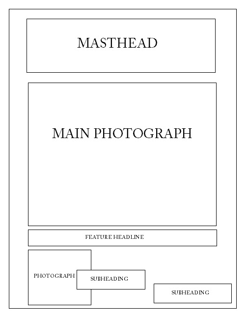
The grey boxes are where the main features will be. The name of the magazine will be at the top so people know it's for that magazine. The box below the masthead is the buttons to press for the main pages. The colours will be the same as the magazine so the readers will recognise the website. The band names will be in purple font.

The main pages I would include are home, news, forum and gig search. On the home page there will be photos of different bands who would be on the front cover of the upcoming magazine so the audience will have an idea on who will be featured. The news page will just have updates on bands so it doesn't spoil anything for them so they can buy the magazine to find out more. The forum will be available to any one who is signed into the website. The forum will allow them to chat about their favourite bands or any thing to do with rock music. It is allowing them to give their thoughts. The gig search will be a page for users to find out where the latest gigs are.

The website will allow other music fans to see what rock music is all about and to let them experience it and give them a choice of liking it or not. The website will attract a larger audience.

Thursday 16 December 2010

draft of front cover

In the end I decided to change my colour theme to black, purple, white and grey instead of black,white and red. I've kept my original layout idea.

Contents page

This is another draft of my contents page. This was going to be my final draft of the contents however others suggested the photo didn't apply well with the genre of rock so I need to retake the photos throughout my magazine.

Draft of contents

Here are some drafts of my contents page. In the first one I have used the same colours as the front cover but included grey. The photo is on the right.

The other draft I have changed colours to the same as my double spread page to see what they would look like and also added a large number under the photo to show it's a feature story. I'm not sure what colours I'm going to use yet but whatever I choose they need to be the same as the front cover and double spread.

Double spread page

This draft of my double spread page was going to be my final however I am going to change the sizes of the font and the photograph. I will keep the quote on the right page.

Draft of double spread page

This is a further development of my double spread page.

Photos


Here are some of the better photos I have taken as the rest were blurry. I am going to use the first image for my double spread page, the fourth one for my front cover and the last one for my contents page. I was going to use the close up of Jess but if I had used it on the front cover you wouldn't be able to see what she is wearing as her costume is important. I didn't use the other photos as it looked like she was fed up in them so it wouldn't appeal to audiences as they may stereotype her as stuck up.


Wednesday 15 December 2010

Draft of contents page

This is a draft of my contents. I have done a black background and used red and white as my other colours. The gap on the left will be filled with a photo and a large number will be placed near it to show the readers that this is a feature story.

Draft of contents page

These are drafts of my contents page. They both have contents at the top. The colour theme is like the front cover so we know it's the same magazine. The black box at the bottom is where I'm going to put the details for subscription. The white space is where the photo will go. The second draft has black boxes. I will replace them with two separate photos. I've also placed the red box higher.

Draft of front cover

This is my first draft of my front cover. This is just a quick draft of where I might place eveything. The masthead will be large and at the top, which is conventional in a music magazine. The price and issue number will be placed underneath. The feature headline will be large and the main image will be in the centre with the other stories around it.

Draft of double spread page

Here is a draft of my double spread page. I have chosen to have a plain black background. The text is in Century Gothic font and is in white. I have made the text bold to stand out. I have highlighted the words which are important in red and also the questions. I have used G1 and G2 as a code for girl 1 and 2 as I haven't chosen names. At the bottom of the page I have incuded a website name for the magazine and underlined it in red. The ... in the top part is going to be the name of the band but I haven't decided what they are going to be called yet.

Draft of double spread page

This is my first draft of my contents page. The background is plain black. The font is Century Gothic and in white. It is bold and I have highlighted the important words in red. The red links back to the magazine's colour scheme. The G1 and 2 stand for girl 1 and 2. I haven't decided names yet so I've used this as code. The story on this double spread page is about a group doing their final tour then going their seperate ways. I've changed the story I am going to use so I stopped making this double spread.

Sunday 12 December 2010

Planning - Double spread and contents

This is a mind map of what is expected on my contents and double spread page.
 

Planning - Front Cover

Here are some hand drawn ideas of what I want my front cover to look like. The first draft has a masthead at the top which is conventional for a music magazine. The price and issue number will be underneath so the readers can see it easily. The barcode will be at the bottom which is conventional. The main image will be in the center to show it'll be the main story and it will grab peoples attention.

In the second draft the masthead is on the side. This isn't conventional in a music magazine so it would be interesting to see if it would attract more readers or not.

Planning - Front Cover

This is a mind map of what is expected on my front cover.

Planning name ideas

Friday 10 December 2010

This is the layout of what my contents page. I will have a main image on the left filling that side. I will then do a box on the right I will have a contents list. I will make some large numbers so certain stories stand out. I will put a large number underneath the main image. The font will be the same as the front cover to show its the same magazine.

Masthead ideas

The name of my magazine is going to be called Pandora. I have chosen this name because it will relate to my target audience as Pandora in Greek mythology was the first woman so it looks female aimed. This name is also appealing and I think will attract audiences attentions. Here are some ideas of what font I am going to use and colours. I am thinking of just using one colour like black, white, red or pink. I might use pink because that stereotypes women. Black, red and white are stereotypically used for rock so I could use that.

I've decided I'm defiantly not going to use the last one because I don't think it is very appealing. I might use the first one or second because they look handwritten and it looks like an autograph which could come from a singer, so it's as if when the reader picks the magazine up they've got their own signed copy of 'Pandora' magazine. The third font is the same as the second but it has tints of red in it. If I use a black background then I'll use a white font, but if I use a white background I will use a black font. I need to make sure what ever colour I choose that I will use the same colours throughout the magazine to show that the contents and double spread page belong to the same magazine.
Here are some ideas for my masthead. I have used different colours behind a main colour to change effect. I am not going to use any of these as I think they look too plain.

Mock up of front cover

This is a draft mock up of the front cover, this is an idea of the layout and colours I will use in the real thing. I have used an image from google of the band The Runaways as my main image. I have cut out the image and placed it in the centre. The background is plain black. Having a plain colour allows everything else to stand out. I have chosen the colours black and white as they're stereotype rock. The masthead is in a bold font and white. This makes it stand out and will grab the readers attentions. The headline 'The Runaways' is in red to match Joan Jetts tshirt and it also has a white outline to make sure you can tell its the main story. I will have the website at the bottom of the page in white. The other stories will be spread around in white. The barcode will be at the bottom which is conventional and I have put the price underneath the masthead.

Monday 22 November 2010

Price of magazine and how often published.

My magazine will be £3.50 and will be published once a month. The magazine will be produced professionally as it won't be rushed.

Friday 19 November 2010

Target Audience

I have decided that my magazine will appeal to 24-35 years old C1 and C2 aimed at mainly females but also will have male elements who are interested in rock. It's mainly aimed at female as usually rock magazines are stereotypically aimed at men. I have chosen to aim at C1 and C2 audiences because they will be able to afford the issues as they would be working.

Top of the Pops Magazine

I have chosen to research the Top of the Pops magazine This is the front cover. It has a masthead which is white and glittery pink. It also has a ident which is a logo. This logo is an advantage for the magazine because its something that the audience will remember and recognise. The main image is of the High School Musical cast. This musical is well known and popular for teenage audiences so this will get their attentions. Zac Efron is considered to be the best looking thing to most teenage girls so him alone will grab teenage girls attention. Vanessa Hudgens and Ashley Tisdale are a good idea to include on the front because young girls look up to them. The white dress Vanessa is wearing connotes innocence. Including Lucas Grabeel is giving diversity as he plays a gay character in the musical. This is showing that the magazine wants a larger audience as they could want them to relate to the actors/singers. The colours used are light, bold, glittery, pink, purple, white and yellow. All these colours are 'girly' which shows they are targetting a female audience. Including extras in the magazine such as 'celebrity love secrets' is making the magazine more interesting.


This is a double spread page from the magazine. The story is focusing on the musical Camp Rock. The right page has a large image of The Jonas Brothers who are a band who stared in the band. As both they and the film are popular, this will grab the attentions of female audiences. They are all looking directly at the camera which looks like they're engaging with the readers. The main girl from the musical isn't included in the large image even though she is the main character, this could be because the magazine is using the boys to grab the attention of female teenage audiences. At the bottom of the page they have included a message from the singers. This gets the audience to be more involved.


There is a contrast between this magazine and a rock magazine. This magazine is bright and using the colours to connote pop music as if you think of pop you can imagine all bright colours and cheesy music videos etc. I have found out that rock magazines use darker colours. Both music genres are completely different from each other, this is why the magazines are completely different so the audience can identify them straight away. Other magazines such as Smash Hits can relate with Top of the Pops as they use the same type of artists e.g. Girls aloud and the same type of features. Classic Rock can't really relate to any other magazine because its more about older rock music rather than NME which provides us with more of Indie Rock.

NME Magazine

This is the front cover for a NME magazine. It features the band The Gossip in the centre. The lead singer is staring at the audience to get their attention. She is dressed in black and the other two members are in white so were made to look at the lead singer. The colour theme is white, black and red. These colours are stereotypically chosen to show this is a rock magazine. There are smaller images used on the left to show other stories. The background is white so it doesn't distract you but instead keep focused on the lead singer. The font is clear and readable. This magazine is suitable for female and male rock fans, ages 15-24 year old as the price is only £1.99 it will be affordable. This magazine front cover is showing the artists in a positive way as they're not doing anything stupid or unsuitable. NME magazine aims to try and stay young and up to date. This magazines publisher is IPC Media.


This is a contents page from NME. The colour scheme is still white, red and black and the font is still the same which shows its the same magazine. There are two images in the centre to go with the text to make it interesting. The contents are split into different sections. There are news, radar,reviews,live! and features. This is consistent in every issue. The subscription advert is on the contents page. This persuades to get the subscription after seeing the contents of the magazine so if they like the magazine they'll be attracted to the advert so they'll want more issues of the magazine.

This is a double page spread. A large image of Lily Allen is on the right page. She is looking at the readers which shows she is trying to engage the audience. She has black hair and make up and a shirt this is to stereotypical make her look like a rock singer. The quote is large and in black and white font. The font looks like its been ripped out of a magazine and stuck into this one.

Reader profile


From this reader profile, 69% are male readers and 31% are female. This shows the magazine is more appealing to men. The average age of the readers is 24 years old. This is the target audience of my magazine which shows people aged 24 are interested in rock magazines.

Monday 15 November 2010

Classic Rock Magazine

This front cover is from the UK magazine Classic Rock. This is a 10th birthday special edition. The colours used are white, red and black. The main image is of the band AC/DC and the photo is in black and white. This is used to show they are an old band. Also using an old band and the masthead 'Classic Rock' shows the magazine is going to have content of rock bands from decades ago.The only text which doesnt include the header is all about the band featured on the magazine which shows its a special edition for that specific band. At the bottom the lightening sign has been used to represent the band. The masthead is large and white to make it stand out. The word rock is larger so the readers will be able to identify the genre of the magazine.

At the top of the magazine there is a series of brand images to promote free gifts. This is to appeal to the audience as its persuading them to buy it even more. The text 'Whole Lotta AC/DC' is an intertextual reference to the AC/DC song 'Whole Lotta Rosie' which will appeal to the audience as they'll understand its meaning. The figure inside the letter O is of a man with a guitar. This is representing rock music. This magazine aims at an older audience as it shows classic rock bands who they will like and its hard to find magazines out there with stories about them. This magazine's publisher is Future Publishing.


This is a contents page from a Classic Rock magazine. It is black and white which gives a classic feel and showing us its an old singer which is relating back to the masthead. The red number and 'cover story' and the black and white text is continuing the same colour theme which is conventional as its showing that its the same magazine. The features are on the right page are neatly presented which makes it easy to read. The woman is looking at the man which conotes that he must be good so we should look at him aswell. Her leg is out which could be to show some sex appeal to the audience.


This is a double page spread from the magazine Classic Rock. On the right page its a full page image of a singer. He is looking at the camera which looks like he is trying to make a connection with the readers. The arrows pointing to the quote draws your attention to the story. All the text is on the right to in black with a white background. This makes it easy to read and is continuing with the same colour theme which shows it still belongs in the same magazine.

Wednesday 10 November 2010

Identify and explain choice of music genre

I have decided that the genre for my music magazine will be rock. I have chosen to do rock because it is a genre I like to listen to.

The magazines that are currently in publication that cover this genre are;
  • Classic Rock
  • NME
  • Kerrang
  • Mojo
  • Q Magazine
  • Rolling Stone

Monday 8 November 2010

LIIAR interpretation of the brief

Language: This is used to describe the subject. Language is used a lot on magazine covers, examples of these terms are headline and masthead. Using colour schemes can represent what type of magazine it is. For example Kerrang magazine uses black and white frequently as these colours stereotypically show its a rock magazine.

Institution: This is the organisations which produce the media. My magazines competition is Future Publishing as they produce Classic Rock magazine which is the same genre which I'm doing so I will choose IPC Media and go in competition with Classic Rock magazine.

Ideology: This is a set of ideas presenting peoples values and stereotypes. The reason for choosing to produce a rock magazine is because I like rock music. The audience who would buy my magazine are likely to be rock music fans as my magazine is on classic rock and the audience who will read this will know a lot about the music.

Audience: Who the magazine is aimed at. My magazine will be aimed at C1 and C2 female audiences. (See later post on audience.)

Representation: This is how the media portrays the magazine to get a response from the public. For my magazine I will portray the artists accurately. The music genre I choose will be represented positively as whatever genre I choose will be a genre I like and to get the audiences to like the artists presented as well.

The Brief

For our main task we have to create a front page, contents and double page spread of a new music magazine. There must be a minimum of four images and all the images and text used must be original.

Thursday 21 October 2010

Evaluation

For this task I had to create a front cover of a college magazine using my own medium close up photograph and also create a draft contents page. First I researched other college magazines to see what was conventional in them. I looked at two different ones and analysed them (look at magazine research post). I chose 'Wyke' as my masthead however these were other ideas;


  • @Wyke
  • College Mate
  • Wyke Days 
I didn't choose 'College Mate' or 'Wyke Days' because I think they would have been too long for a masthead. The reason I chose 'Wyke' because its simple and everyone will know its for that college. I chose the text to be in black so it stands out. I also looked at different fonts as I couldn't decide which one to use. Ones which I was going to use were;


  • Arial
  • Stencil STD
  • Rosewood Std Regular
I didn't use Arial because it would have been too boring and not attractive. I didn't use Rosewood Std Regular because its hard to see what it says. The reason I chose the font I did was because it looked modern and bold which made it stand out. I created a header for the top and bottom of the page and made it a light purple. This was to represent the colour of Wyke's actual sign colour. I chose to take a photograph of just one student as I didn't want the page have too much on. The student has a bag and suitable clothing to show he is a student. Having a student on the front cover is conventional for a college/school magazine. I chose the background white as it connotates peace, calmness and freedom so this could represent the type of college Wyke is and also the student is wearing a white tshirt to show this aswell. I put the college website at the bottom in a dark purple to keep with a theme. I positioned the text like I did so it looked different and grab people's attention. The magazine is free so students will want to read it. It's conventional to include an issue number so I included one onto my front cover. The target audience is for both genders and for students aged 16-18(look at post on target audience). To improve my cover I could make the photograph lighter so you could see the students face more clearer as it is quite dark. For my planning I created IT drafts of the layout of what my front cover and draft contents would look like and wrote what and why I would do it in that way. I also took photos of a student where he had different poses. For example work in his hand or him posing for the camera. This was to give me an idea and a guide to what my final piece would be like.


For the contents page I tried to keep the same colour theme by using the same light purple and black to show that it comes from the same magazine. I did a different font as I couldn't decide which one to use but if I did it again I would make sure it's the same as the front cover so you can tell it's the same magazine. The layout of the contents is simple so it is easy to read. I have included one photograph to keep the magazine interesting. I have used a larger number as this shows that this is a feature story and students should read it. The photograph dennotates students are working and showing the readers that they have settled in Wyke, this connotates that the picture is representing the heading 'A new start to Wyke' as they are showing that there new start to Wyke is a good one. I looked at college magazines contents pages to see what was conventional. Some of the contents is what is on the front of the magazine which is conventional to do for a college magazine.

Final Front Cover


This is my final front cover.

Unused photographs

Here are some of the photographs I didn't use.

The reason I have chosen the photograph I have is because the student is looking at the camera with a smile on his face which is showing that he is happy at Wyke. The bag on his shoulder also looks like he is a student. In some of these photographs he isn't looking at the camera so it doesn't look good as he's not making eye contact with the readers which is conventional for a college magazine. It doesn't matter about the background because I'm going to edit it out so it's just white.

Wednesday 20 October 2010

Final contents draft

This is my final draft for my contents page.

Drafts of contents page


I have created two drafts of what my contents page might look like. The first one includes two photographs with a subheading for each to show the reader what is going on. The contents list will be between the pictures. I would keep the same colour theme as the front cover so you can tell its the same magazine. I wanted the page to be simple so it will be interesting. The second draft would also have the same colour theme as the front cover. I've only included one part for the contents list so its easier to follow. Also one photograph near the bottom with its own subheading and page number.


Friday 15 October 2010

Idea Development - Front Cover

I have created two drafts of what my front cover may look like. The first draft is simple because it only includes one photograph and a few subheadings. I think having a simple front cover is good because if it had loads of information on the front students won't find it interesting but instead boring. The subheadings will have to be on top of the photo depending on how big it'll be. The second one includes a masthead which is at the top of the page then underneath in the centre will be a main photograph of students who go to Wyke College. The feature headline will either be underneath or on the side, but it would have to be on top of the photograph because I want the photograph to be large. At the bottom of the page I want another small photograph of something else that represents Wyke with the subheading next to it to show the audience whats the photograph about. I could make the subheadings be in coloured boxes to make them stand out and be attractive. The photo will be of a student or students together to represent Wyke College. I want the font and colours to be simple so it stands out. Some of the features may include advertisements for Wyke's Halloween party, new dinner menu, NUS cards on sale, students who have won something etc.


Monday 11 October 2010

Conventions of a college magazine

There are many features of a college magazine. There are a few features that are the same as a regular magazine for example the title. This is important because everyone needs to know what the magazine is called. Also headings and main features are important because they also help the audience know what's going on and what is included in the magazine. A date and issue number are featured on the magazine so everyone knows what issue it is. The main photograph always have something to do with what it is trying to inform in this case it would be educational photographs as its for a college magazine.

Target Audience

For my magazine my target audience will be for males and females aged 16-18 who go to Wyke College or who want to attend the college. The stories inside will include things what is happening in the college for students to join in. For example revision classes, events such as the college parties, dinner or after college clubs. The magazine could also be aimed at parents of the students as they will be able to read what is going on aswell.

Sunday 10 October 2010

Magazine Research

I have found some examples of different college magazines from Lewisham College. They started their magazine in 2008 calling it The Eye however they had a re-launch of the magazine now calling it The LC. Both these links gives an example of both the new and old magazine.

The Eye

The front cover is quite plain as it only has one photo of a boy. He looks like a singer as there is a microphone. The microphone covers one of his eyes and shows the other, this represents the magazines name. This cover makes you think its for a music magazine not for a college one. There is a colour scheme which is used throughout the magazine.The contents page is nicely set out as it has images and contains readable text. The magazine pages are all relevant which makes this magazine appeal to its audience.

The LC

The front cover is better than the Eye magazine because not only does it have photos it also has headings to let you know whats going to be in the magazine. This helps its audience because if people don't know whats in it then they wont want to read it. The colours of the text is the same as the clothes that the boy is wearing. The contents page in this magazine looks more formal and also includes a message from the principal on the side of it. This shows the audience that its still a college magazine. I looked at different issues of this magazine and they use same feature pages every week but change it e.g. Tutor profile they change the tutor every week so we can learn new things about them.

Here are the links

http://www.lewisham.ac.uk/media/92069/eye_summer_2008.pdf

http://www.lewisham.ac.uk/media/135739/the%20lc%20final.pdf

Friday 8 October 2010

LIIAR interpretation of the brief

Language: This is used to describe the subject. Language is used a lot on magazine covers, examples of these terms are headline and masthead.

Institution: This is the organisations which produce the media. In my case Wyke College is the Institution because its for Wyke College.

Ideology: This is a set of ideas presenting peoples values and stereotypes.

Audience: Who the magazine is aimed at. For my college magazine it will be for 16-18 year olds who attend Wyke College.

Representation: This is how the media portrays people to get a response from the public.

The Brief

For our preliminary exercise we have to use DTP and an image manipulation program to produce the front page of a new school/college magazine featuring a photograph of a student in medium close-up plus some appropriately laid out text and a masthead. Additionally we must produce a mock up of the layout of the contents page to demonstrate our grasp of DTP.