Thursday, 21 October 2010

Evaluation

For this task I had to create a front cover of a college magazine using my own medium close up photograph and also create a draft contents page. First I researched other college magazines to see what was conventional in them. I looked at two different ones and analysed them (look at magazine research post). I chose 'Wyke' as my masthead however these were other ideas;


  • @Wyke
  • College Mate
  • Wyke Days 
I didn't choose 'College Mate' or 'Wyke Days' because I think they would have been too long for a masthead. The reason I chose 'Wyke' because its simple and everyone will know its for that college. I chose the text to be in black so it stands out. I also looked at different fonts as I couldn't decide which one to use. Ones which I was going to use were;


  • Arial
  • Stencil STD
  • Rosewood Std Regular
I didn't use Arial because it would have been too boring and not attractive. I didn't use Rosewood Std Regular because its hard to see what it says. The reason I chose the font I did was because it looked modern and bold which made it stand out. I created a header for the top and bottom of the page and made it a light purple. This was to represent the colour of Wyke's actual sign colour. I chose to take a photograph of just one student as I didn't want the page have too much on. The student has a bag and suitable clothing to show he is a student. Having a student on the front cover is conventional for a college/school magazine. I chose the background white as it connotates peace, calmness and freedom so this could represent the type of college Wyke is and also the student is wearing a white tshirt to show this aswell. I put the college website at the bottom in a dark purple to keep with a theme. I positioned the text like I did so it looked different and grab people's attention. The magazine is free so students will want to read it. It's conventional to include an issue number so I included one onto my front cover. The target audience is for both genders and for students aged 16-18(look at post on target audience). To improve my cover I could make the photograph lighter so you could see the students face more clearer as it is quite dark. For my planning I created IT drafts of the layout of what my front cover and draft contents would look like and wrote what and why I would do it in that way. I also took photos of a student where he had different poses. For example work in his hand or him posing for the camera. This was to give me an idea and a guide to what my final piece would be like.


For the contents page I tried to keep the same colour theme by using the same light purple and black to show that it comes from the same magazine. I did a different font as I couldn't decide which one to use but if I did it again I would make sure it's the same as the front cover so you can tell it's the same magazine. The layout of the contents is simple so it is easy to read. I have included one photograph to keep the magazine interesting. I have used a larger number as this shows that this is a feature story and students should read it. The photograph dennotates students are working and showing the readers that they have settled in Wyke, this connotates that the picture is representing the heading 'A new start to Wyke' as they are showing that there new start to Wyke is a good one. I looked at college magazines contents pages to see what was conventional. Some of the contents is what is on the front of the magazine which is conventional to do for a college magazine.

Final Front Cover


This is my final front cover.

Unused photographs

Here are some of the photographs I didn't use.

The reason I have chosen the photograph I have is because the student is looking at the camera with a smile on his face which is showing that he is happy at Wyke. The bag on his shoulder also looks like he is a student. In some of these photographs he isn't looking at the camera so it doesn't look good as he's not making eye contact with the readers which is conventional for a college magazine. It doesn't matter about the background because I'm going to edit it out so it's just white.

Wednesday, 20 October 2010

Final contents draft

This is my final draft for my contents page.

Drafts of contents page


I have created two drafts of what my contents page might look like. The first one includes two photographs with a subheading for each to show the reader what is going on. The contents list will be between the pictures. I would keep the same colour theme as the front cover so you can tell its the same magazine. I wanted the page to be simple so it will be interesting. The second draft would also have the same colour theme as the front cover. I've only included one part for the contents list so its easier to follow. Also one photograph near the bottom with its own subheading and page number.


Friday, 15 October 2010

Idea Development - Front Cover

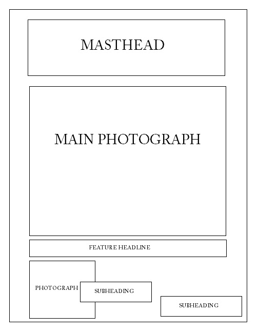
I have created two drafts of what my front cover may look like. The first draft is simple because it only includes one photograph and a few subheadings. I think having a simple front cover is good because if it had loads of information on the front students won't find it interesting but instead boring. The subheadings will have to be on top of the photo depending on how big it'll be. The second one includes a masthead which is at the top of the page then underneath in the centre will be a main photograph of students who go to Wyke College. The feature headline will either be underneath or on the side, but it would have to be on top of the photograph because I want the photograph to be large. At the bottom of the page I want another small photograph of something else that represents Wyke with the subheading next to it to show the audience whats the photograph about. I could make the subheadings be in coloured boxes to make them stand out and be attractive. The photo will be of a student or students together to represent Wyke College. I want the font and colours to be simple so it stands out. Some of the features may include advertisements for Wyke's Halloween party, new dinner menu, NUS cards on sale, students who have won something etc.


Monday, 11 October 2010

Conventions of a college magazine

There are many features of a college magazine. There are a few features that are the same as a regular magazine for example the title. This is important because everyone needs to know what the magazine is called. Also headings and main features are important because they also help the audience know what's going on and what is included in the magazine. A date and issue number are featured on the magazine so everyone knows what issue it is. The main photograph always have something to do with what it is trying to inform in this case it would be educational photographs as its for a college magazine.